 |  |
|---|---|
 |  |
 |  |
 |  |
 |  |
 |
EDIBLE EQUALITY CHOCOLATE PACKAGING
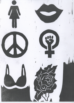
The assignment was to design a chocolate package for someone you would not ordinarily design for, consisting of five bars/flavors and some type of box for the set. My concept was based on my roommate, an uncommonly outspoken liberal feminist. Channeling the feminist perspective, I used five key symbols to denote the different flavors. I made the shapes on the bars as well as the roses on the outer package from woodcut prints which were later scanned in. I liked the gritty and homemade feel I could evoke with the woodcut texture. The shapes include a bra, a peace sign, a woman, a pair of lips, and the Venus symbol with the fist in it, a common badge for feminists. The use of roses was inspired by tattoos, a common theme in the feminist research I conducted. Roses symbolize an interaction between the ladylike and the tough, imperative qualities for a feminist in today's world. I called my company Gaia, the Greek goddess of Mother Nature, because it is a natural and health conscious corporation. I printed the designs on Neenah Environment paper to create an earthy and recyclable feel, as my roommate is also environmentally conscious.