top of page
 |  |
|---|---|
 |  |
 |  |
 |  |
 |  |
 |  |
 |  |
PUBLIC MAGAZINE
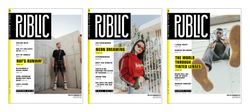
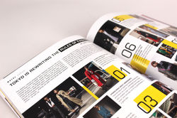
I created and designed a street style magazine called Public. I chose the name because I wanted to feature the style of the masses. The masthead was created to look interconnected and active, a loose reference to a cityscape, or urban living. I used yellow throughout to keep it sleek and lively, in different ways to denote departments and features. I selected the typeface Eurostile, and employed almost the entire family, to keep with my vertical look of the masthead, and the condensed nature helped it to feel very modern and urban.
bottom of page